


The ReviewX Dashboard (ReviewX → Dashboard) provides an executive overview of your store’s customer sentiment, review collection performance, and cloud synchronization status — giving you actionable insights at a single glance.
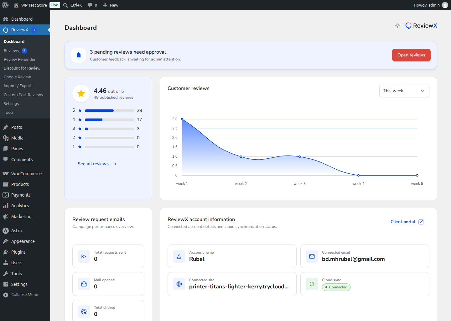
Dashboard Widgets Breakdown
- Pending Reviews Alert Banner: Positioned prominently at the top of the dashboard, this banner highlights feedback waiting for moderation (e.g., “3 pending reviews need approval”). Clicking Open reviews takes you directly to the pending moderation queue.
- Overall Store Rating: Displays your aggregate review score (e.g. 4.46 out of 5 based on 48 published reviews) alongside an interactive 5-star to 1-star distribution bar chart showing exact counts and percentages.
- Customer Reviews Trend Chart: A smooth time-series volume graph plotting review submissions over time, with filter options (such as This week, This month, or custom intervals) to identify campaign spikes.
- Review Request Emails Analytics: Real-time delivery metrics tracking your automated post-purchase email performance:
- Total requests sent: Total reminder emails dispatched.
- Mail opened: How many recipients opened the invitation.
- Total clicked: How many customers clicked through to the submission form.
- ReviewX Account Information: Confirms your active connected account details — including Account Name, Connected Email, Connected Site domain, Cloud Sync status (with a green Connected indicator), and a direct link to the Client Portal.


