


ReviewX provides a dedicated WordPress Live Customizer panel that lets you fine-tune the typography, colors, borders, shadows, and layout of your review ecosystem with real-time visual feedback. Every adjustment updates instantly in the preview window via postMessage transport without requiring a page reload.
In ReviewX 3.0+, appearance settings are stored cleanly per post type, allowing WooCommerce products to maintain your primary store branding while custom post types can either inherit that look or feature their own bespoke design.
Note: The Live Customizer controls typography, spacing, colors, and layout shapes. If you want to change review criteria, order status triggers, or email notifications, visit ReviewX → Settings in your WordPress admin.
Step 1: Access the ReviewX Customizer Panel
To style your review widget with live storefront context:
- Navigate to your store front-end and open any single product page that has reviews enabled.
- Click Customize in the top WordPress admin bar, or navigate in wp-admin to Appearance → Customize.
- Locate and click the ReviewX panel in the Customizer navigation sidebar.
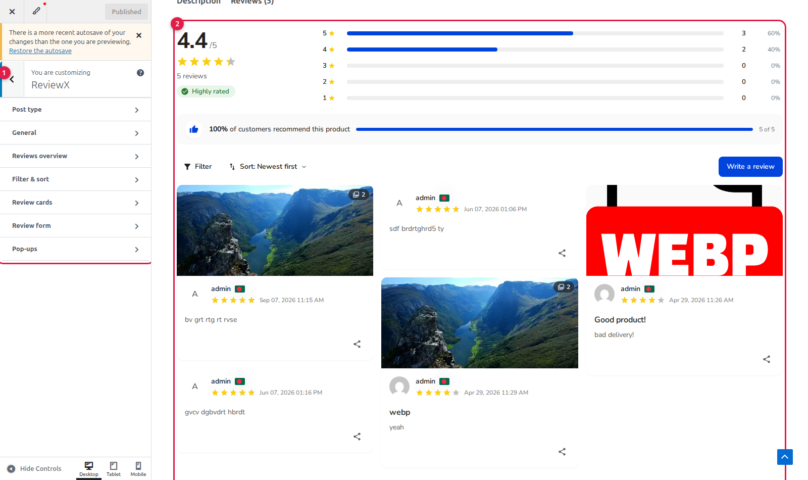
Inside the ReviewX panel, you will see dedicated configuration sections:
- [1] ReviewX Panel Navigation: Access Post Type selection, General styling, Reviews Overview, Filter & Sort, Review Cards, Review Form, and Pop-ups.
- [2] Real-Time Interactive Storefront Preview: Displays your live WooCommerce product review section, automatically reflecting changes as you adjust sliders and color pickers.
Step 2: Choose Post Type Scope & Inheritance
ReviewX allows you to style different post types independently:
- Click into the Post type section at the top of the panel.
- Under Customise the look for, choose
Product (default)to define your store-wide review appearance. - If you have registered Custom Post Types (such as Portfolio, Courses, or Books), selecting them displays an Inherit the Product look toggle:
- Enabled (Default): The custom post type automatically uses all colors, fonts, and radii configured for Products.
- Disabled: Unlocks independent styling controls for that specific post type, allowing a distinct brand aesthetic.
Step 3: Style the Review Cards & Feedback Feed
Open the Review cards section to control how individual customer reviews appear in the list:
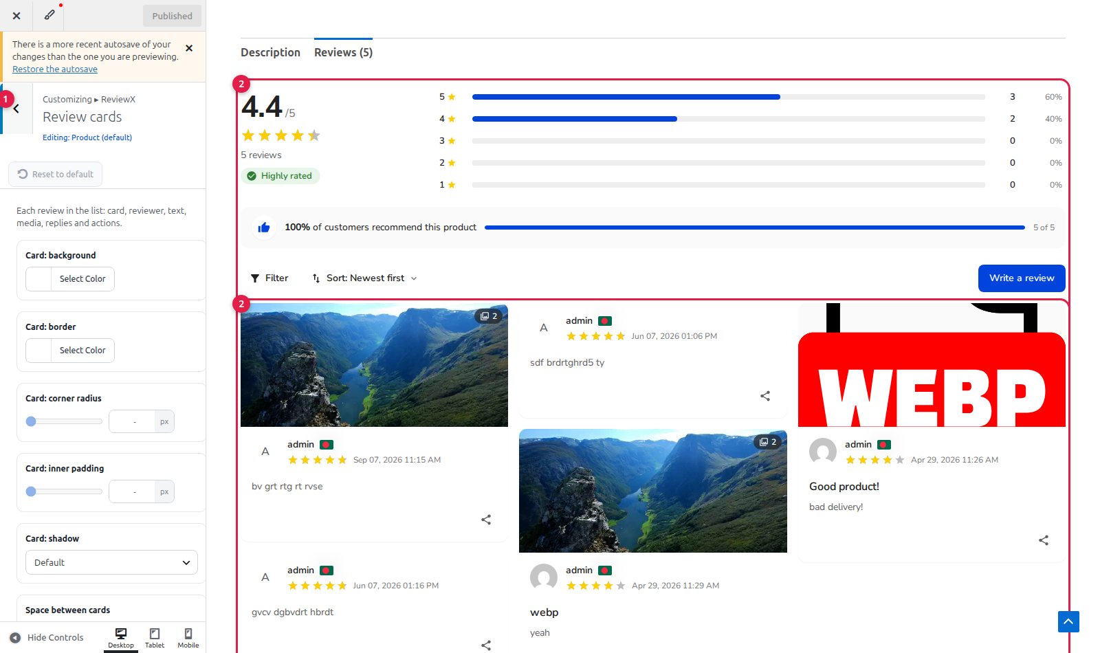
- [1] Card Appearance Controls:
- Card Background: Set the card fill color (supports hex and rgba values).
- Card Border: Define border color and thickness.
- Card Corner Radius: Slide from
0px(sharp corners) to40px(pill-curved cards). - Card Inner Padding: Adjust spacing between review content and card borders (0 to 48px).
- Card Shadow: Choose from
None,Subtle (sm),Soft (md), orElevated (lg). - Space Between Cards: Adjust grid/list gap between consecutive reviews.
- [2] Review Content & Media Styling:
- Reviewer Avatar: Set avatar shape to
Circle,Rounded square,Square, orHidden, and adjust dimensions (24px to 72px). - Verified Badge Colour: Highlight verified buyer badges with your brand trust color.
- Typography & Weights: Customize font sizes and weights (Regular, Medium, Semibold, Bold) for reviewer names, review titles, dates, and feedback body text.
- Photos & Video Thumbnails: Configure thumbnail corner radius and display dimensions.
- Helpful Votes & Social Share: Customize active and default colors for thumbs-up voting buttons and social sharing icons.
- Store Owner Replies: Set custom background, accent line, and text colors for official merchant responses.
- Reviewer Avatar: Set avatar shape to
Step 4: Configure Overview Statistics & Review Form
Explore the remaining sections to create a cohesive review experience:
- General: Set global font family (choose from popular Google Fonts like Inter, Roboto, Poppins, Montserrat, or inherit from your theme), base text size, star size, and widget max width.
- Reviews Overview: Customize average rating number typography, rating badge background, distribution bar fill and track colors, and recommendation percentage bars.
- Filter & Sort: Style filter dropdown buttons, sorting menus, active chip highlights, and the prominent Write a review button.
- Review Form: Style the submission form container, input field borders, focus ring glow, label weights, and the primary Submit button.
- Pop-ups: Set backdrop overlay opacity, modal background color, and dialog corner radii for image lightboxes and success confirmations.
Step 5: Publish Your Customizer Styles
Once you are satisfied with the appearance:
- Click Publish at the top of the WordPress Customizer pane.
- ReviewX automatically flushes internal storefront caches, purges active page caching plugins (LiteSpeed, WP Rocket, W3 Total Cache), and syncs your updated design tokens to ReviewX Cloud.
- Visit your storefront in an incognito window to verify that your new review styling renders consistently across all devices.


