
10+ Stunning Customer Testimonial Page Design Ideas That Can Convince
- Published
- ReviewX Team
Are you starting a new business website or trying to revamp your existing one? Here is a great tip for you – showcasing customer testimonials is a must if you want to add social proof and credibility. And while there are many ways to display reviews from users, the best way to do so is to create a dedicated customer testimonial page that instantly grabs attention.

With a stunning design and the right organization, a testimonial page is a perfect way to tell your business’ success stories, while showing real use cases of your products, and adding the much-needed credibility to boost conversion rates.
“Where possible, we always recommend clients to set up a testimonials page on websites we build for them, since they are so important for conversions,” according to Donald Chan, founder of IMPACT, a leading digital marketing agency in Singapore.
In this blog, we will explain why customer testimonials are important for the success of your business. We’ll also walk you through some of the best practices that you can use to create an eye-catching testimonial page and give design ideas that can convince users easily.
Testimonials Are Essential To Boost Conversion Rates
When it comes to creating a stunning business website that sells better or creates convincing marketing communication with your users, the addition of a customer testimonials page is the most effective.

Real use case reviews or testimonials provide that final push of encouragement to your website visitors to buy your product or service and convert into a paying customer. According to a detailed 2021 testimonial analysis by Boast.io, more than 90% of customers read online reviews before making a purchase because they find peer recommendations most reliable.
Testimonials are an immensely convincing way to inform potential clients what your business can do and what type of services you offer because word of mouth (especially from other users) is the most persuasive form of credibility.
However, it is also equally important to showcase your customer testimonials in an attractive way that instantly grabs your users’ attention to garner the most impact. This is why a properly thought-out customer testimonial page is your secret weapon to drive more conversions.
Best Practices & Tips For Designing A Testimonial Page

So now that we have an idea of why a detailed customer testimonial page is essential for your business’ success, it’s time we dive into some of the best practices to follow while creating one.
🖼️ Combine Text With Engaging Visuals
While most customers provide text reviews of your products and services, a complete testimonial page full of text reviews will look monotonous and drive away more users than bring in new customers.
Therefore, it is very important to combine the client’s texts with engaging visuals like images, videos, and more. Pictures and videos instantly add to the authenticity of your marketing campaigns and promotional posts. Hearing satisfied customers talk about their purchases or seeing the products being put to real use is a sure way to convince potential clients.
More than 80% of video marketers say videos have helped to increase sales greatly as around 74% of customers say they were convinced to make the final purchase by watching a video.
⭐ Display Use Cases Of Your Product
This brings us to our next tip – you can add user-generated product reviews containing real-life images of the product to your testimonial pages for an extra effect. More often than not, potential customers will want to view the ‘real-life’ images showcasing real user cases of the product before purchasing it to check for the product quality.

This is why using multi-criteria-based reviews can build a positive reputation for your business or website as they show unfiltered feedback left by existing customers.
#️⃣ Use Specific Numbers To Add Proof
Finally, you should always try to include as many details as possible – which includes counters and statistics. Showcasing a specific number of 5-star ratings or number of products sold over a certain time creates believable social proof and encourages conversion. Try to provide actual statical numbers on your customer testimonial page, such as percentages that represent the growth and success of your business.
Few Quick Tips & Tricks That You Can Use:
🎯 If you use images or videos on your testimonial pages, make sure they are of the highest quality you can manage. It is essential that potential users understand what the multimedia testimonials are trying to convey to them.
🎯 Along with multimedia testimonials you can also add other formats of customer reviews such as tweets and other social media posts related to your products.
🎯 Develop your website customer testimonial page in a way that reviews get filtered out by users’ location and preferences. This can be done using cookies and other analytics data based on users’ activities on your website.
Get Inspired With 10 Stunning Customer Testimonial Page Designs
In this section, we want to highlight some popular websites and platforms that have beautifully and successfully used the practices and tips mentioned above to decorate stunning customer testimonial pages.
Take a look at the 10 stunning testimonial page designs below and get inspiring ideas to showcase engaging product and service reviews on your own website:
🏆 ZenDesk
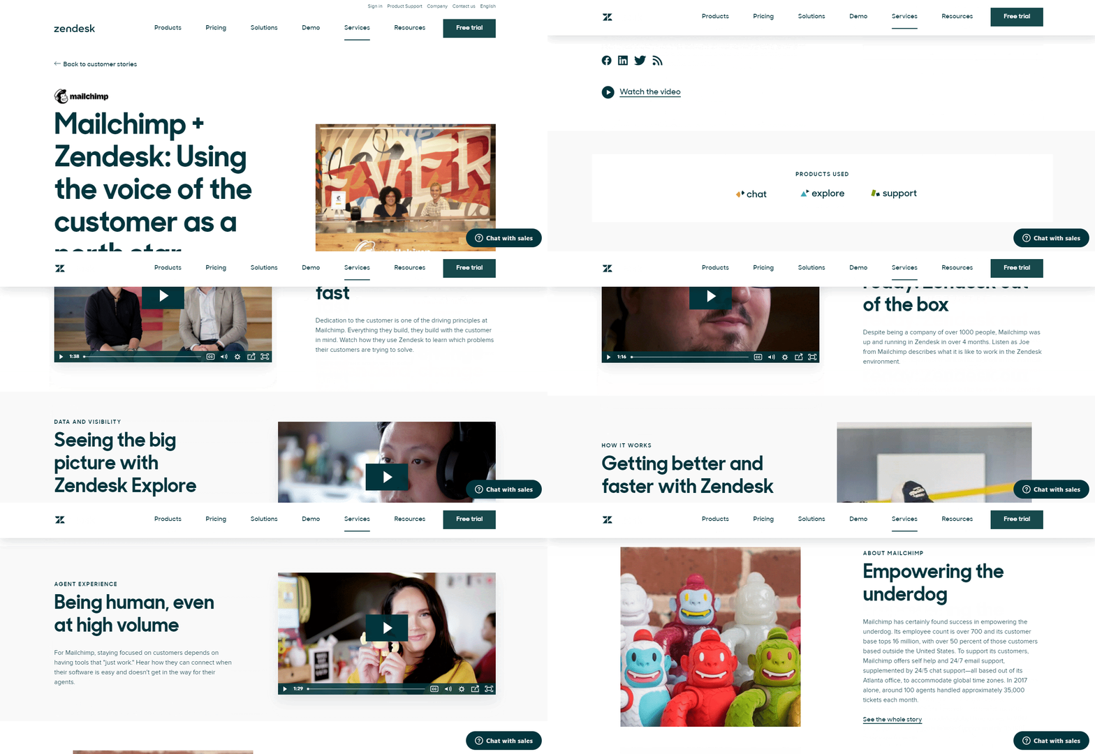
ZenDesk, the software as a service platform, named their stunning customer testimonial landing page as ‘Customer Stories’ and uses it to direct users to testimonial articles about the users’ experience with the company.
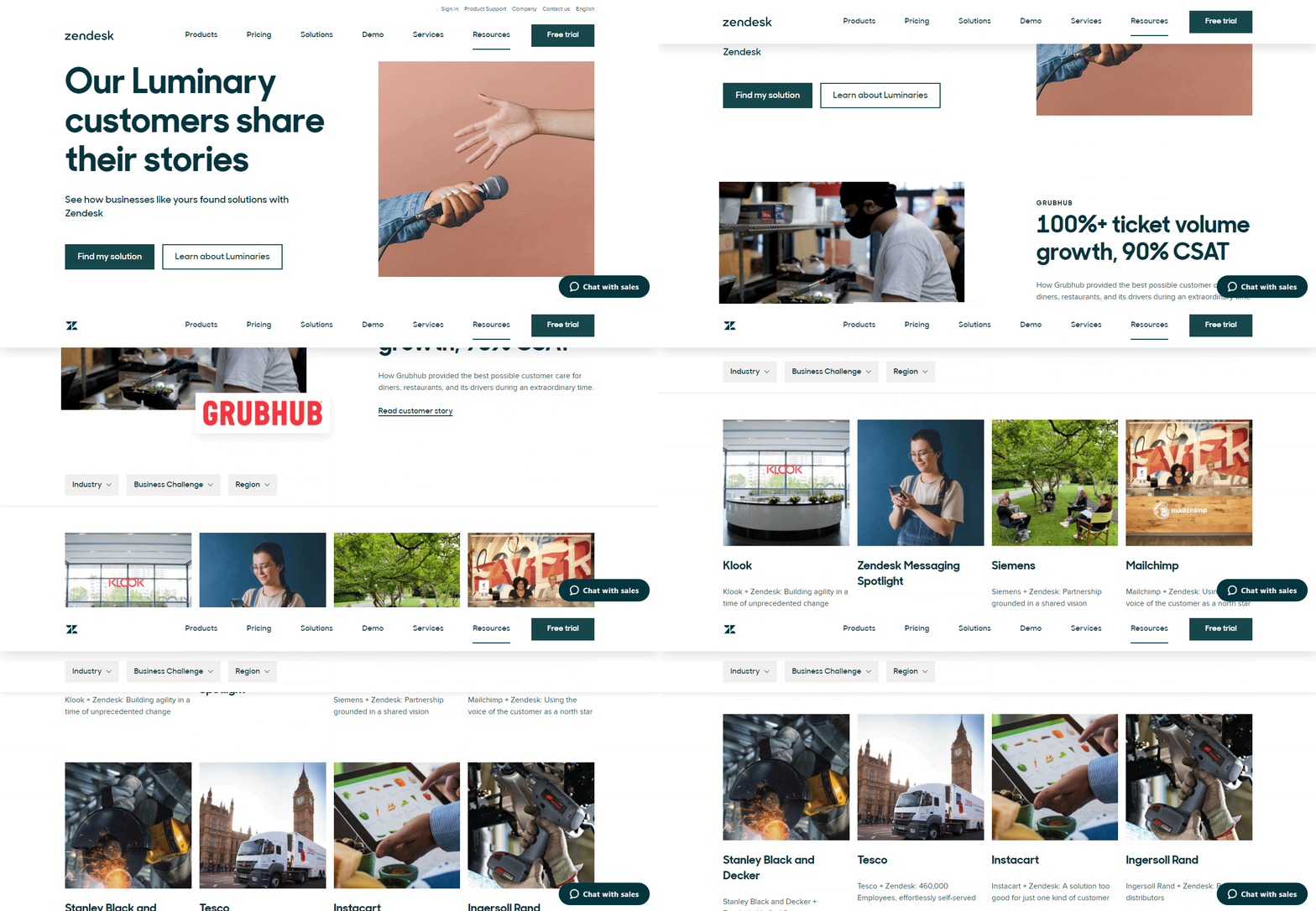
Not only that, but it also contains colorful high-quality images, interactive call to action buttons to urge users to explore more, statistical numbers that convince, and much more.
The client’s story pages are no less – on the testimonial landing page small snippet of each story and click to read the full narrative. With beautifully laid out and functional user-generated videos, thumbnails linking to the full customer stories for a variety of big-name brands, and attention-grabbing counters, Zendesk showcases stories from their customer experiences and convinces potential clients.
🥘 ChowNow
Next, we have ChowNow, an online food ordering system based in California. Its customer testimonial page exclusively features several videos and quotes from customers. Its simple design helps users to navigate through reviews from different restaurants and food shops. For an even cleaner look, the food delivery platform has opted for engaging call-to-action play buttons instead of video thumbnails for some of the videos.
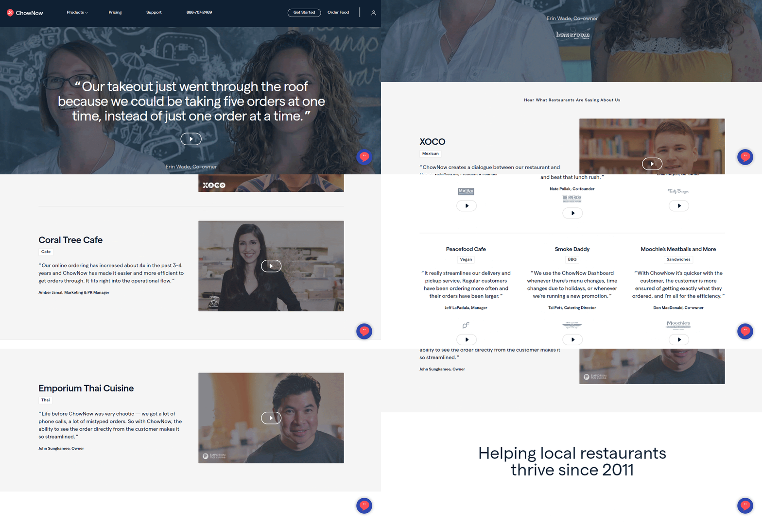
These short videos are detailed to cover testimonials from the client restaurants’ sales before and after they got connected to ChowNow and step-by-step guides on how easy the platform is to use.
💼 Slack
Just like ZenDesk, Slack has named their customer testimonial page Customer Stories but they have switched up their approach on highlighting individual companies or users to a much more colorful one with eye-catching designs.

Each testimonial highlights specific key product features and how the customer used them, using quotes, thumbnails, and customer case studies. But what attracts users more is that they can easily filter the testimonials according to their product preferences and needs.
💻 Hootsuite
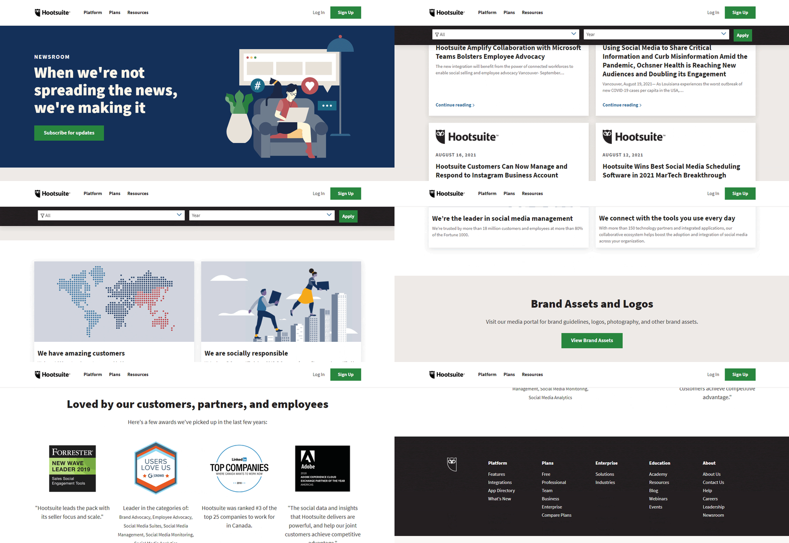
Hootsuite provides us with another great example of a stunning customer testimonial page that demonstrates case studies of how their product works and has helped different users. Users can also easily navigate to specific types of reviews and case studies using filters.

This website also features a stunning news and updates page where you can get new articles and other testimonials that Hootsuite has made an appearance. It showcases statistical numbers and displays other popular brands that have used Hootsuite for their social media marketing.
🎨 Dribbble
Dribbble is an online design community and uses its design skills to create an outstanding customer testimonial page. User quotes and images are displayed in a simple two-column layout and highlighted with striking, bright, and happy colors.

It’s quite clear that the testimonials are unfiltered and unedited which immensely adds to the website’s authenticity and credibility, and easily convinces potential customers of their trustworthiness.
The names of the users or companies are also highlighted in bright pink color that redirects visitors to their Dribble accounts for further engagement.
🎉 Bizzabo
Bizzabo, an event management software provider has mixed and matched different formats of customer testimonials. You will find Twitter tweets, a series of written case studies, and also video reviews. The thought-out, engaging customer testimonial page also showcases customer service ratings.

Apart from the creative, colorful layout and combination of testimonial formats, what attracts website visitors the most is the use of reviews straight from social media platforms. It also offers several case studies on that same page that users can navigate through and explore.
🚀 HubSpot
HubSpot on the other hand features enthusiastic customer reviews and stories for different industries and companies. Again, this brilliantly designed customer testimonial page uses a bright and inviting color to catch users’ eyes and convince them to take proper action.

With a few clicks, you can easily check out each case study, get a free demo, understand which popular brands are working with HubSpot, and much more. It also displays amazing 5-star ratings and customer quotes for a deeper effect.
📊 Xero
Xero stands out from the rest of the testimonial pages mentioned above because instead of displaying testimonials for several different companies and industries together, it lets you pick which industry you want to explore.

This beautifully designed and extremely user-friendly testimonial landing page also features detailed biographies of its users and includes quotes, videos, and images depicting how a client uses Xero.
🖥️ Codecademy
Codecademy uses its powerful customer testimonial page to explain to users their missions and goals – to help users learn codes with ease.It showcases a video testimonial along with many stories from real students of the academy.

This is a great way to connect to newer and potential learners. These reviews and testimonials are a perfect way to add credibility and show visitors how Codecademy helped an individual gain new and outstanding skills.
🧥 Stio
Stio is a clothing retailer and has effectively used its customer testimonial page to showcase brand popular ambassadors who wear their products and advocate the mass. The testimonial page consists of interview questions, the ambassador’s success stories with the brand, and a product carousel at the bottom to help visitors see what else the brand offers.

Bonus: 15 Ways To Get Product Reviews & Gain Customer Trust
And the list can go on. Hope this blog was helpful and gave you many ideas on stunning customer testimonial pages for your website. You can also check out this blog to find out 15 ways to easily collect customer testimonials.
How excited are you to create a stunning new testimonial page or revamp your existing one with these awesome strategies to gain customer trust and a product review? You can share your thoughts and ideas easily via comments or by joining our Facebook community. And to be the first to get updates on upcoming blogs, and tutorials, subscribe to our blog.
Increase sales with customer reviews
Showcasing customer experiences helps build trust and drive higher sales.
Related Articles

Best Tool for WordPress Web Agencies
Finding the best tools for WordPress agencies can feel overwhelming – last Tuesday, I watched one of my

Best Cyber Monday Deals of 2025 for WordPress Web Agencies
Looking for the best Cyber Monday deals of 2025 for WordPress web agencies? You’re in the right place.

Judge.me is Leaving WordPress – Here’s the Best Judge.me Alternative (and How to Migrate Easily)
If you’re using Judge.me on your WooCommerce store, there’s an important update you can’t ignore: Judge.me is officially