


If you are struggling with boosting your conversion rates, then call-to-action examples (CTA) can be very useful for you. Taking inspiration from the best call-to-action buttons, you can easily optimize your own CTA buttons and boost your conversion rate. In this blog, we are going to show you the 10 best call-to-action examples that you can look at for inspiration.
💡 What Is Call To Action (CTA) & Why Does It Matter?
A call to action (CTA) is a text which inspires visitors to make specific actions. It can be designed for asking visitors just to click on a link, subscribe to anything, or buy something. In marketing, a CTA is extremely important to guide visitors for taking action.
You can find different types of call to action such as plain text with no link, text link, or button on different websites. A CTA can be a two-line phrase or long sentence which will trigger and guide the visitor to take action. So, if you want to influence your visitors to take action you must add really good CTAs on your website.
✨ 10 Best Call-to-Action Examples of 2022
A good call-to-action button can easily attract the eyes of your visitors and guide them to take action. Here we are going to discuss the 10 best examples of a call to action buttons that you can take inspiration from. So, let’s go below and explore the most attractive CTA examples.
1. EmbedPress
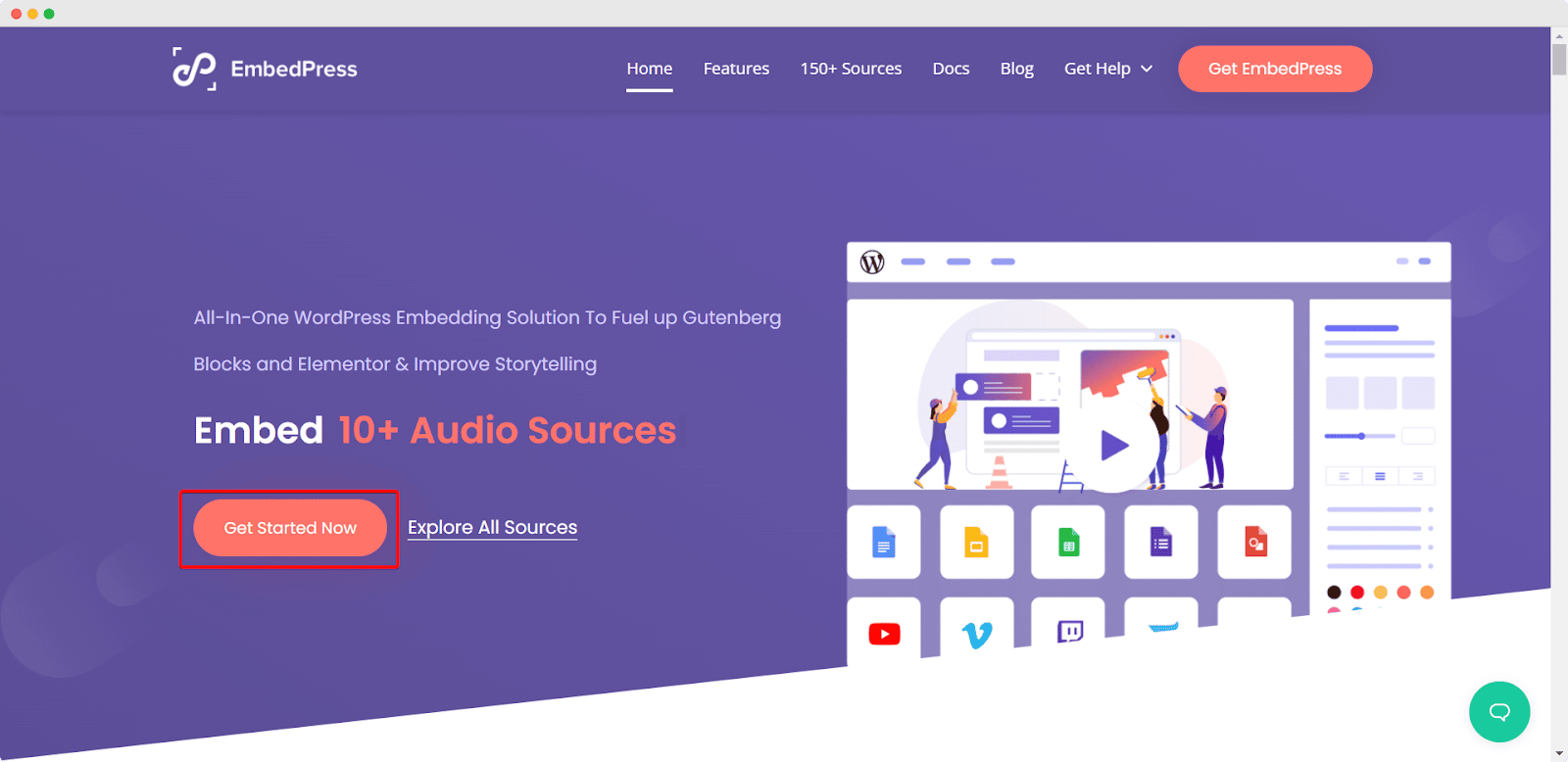
First, let’s have a look at the textbook call to action ‘Get Started Now’ in the hero section. Here on the hero section of the EmbedPress website, you can see small descriptions of their product and ask them to get it straight away. There is an alternative call to action button for letting the visitors explore all the features first before getting started. You can take inspiration from this call-to-action example and convert your visitors into customers and provide the best user experience.
2. Evernote
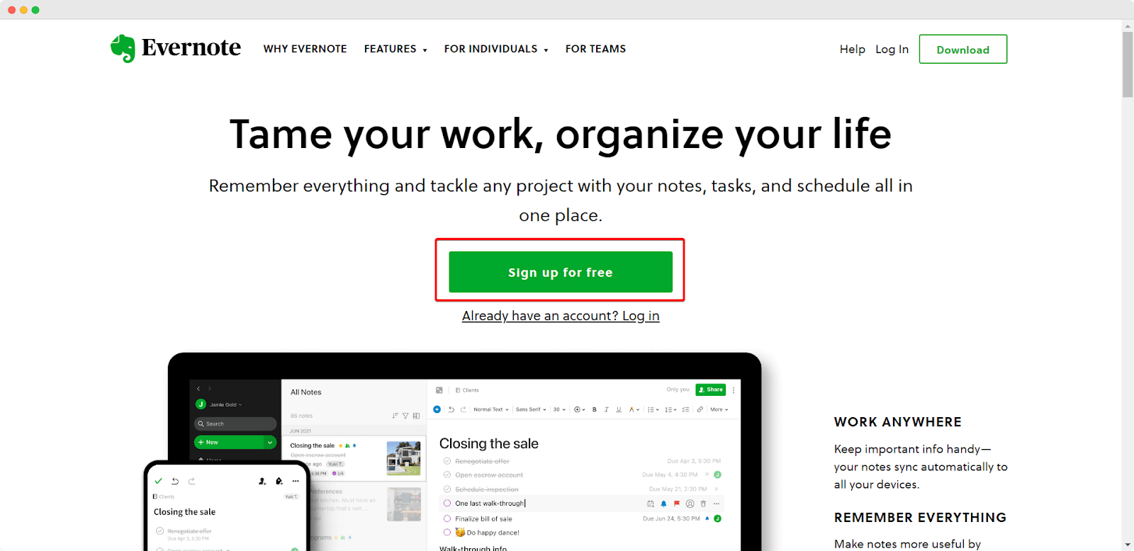
Evernote has a similar approach to placing its call to action button. They have added call-to-action buttons on the hero section saying ‘Sign up for free’ in the middle of the web layout. You can see they have added the trigger word ‘free’ to their text and highlighted the whole call to action phrases in bold color and blank space. So, any visitors will get attracted to their call to action button and those who already took action can choose the alternative CTA button from below. You can also follow this example to design CTA for your website.
3. Apple
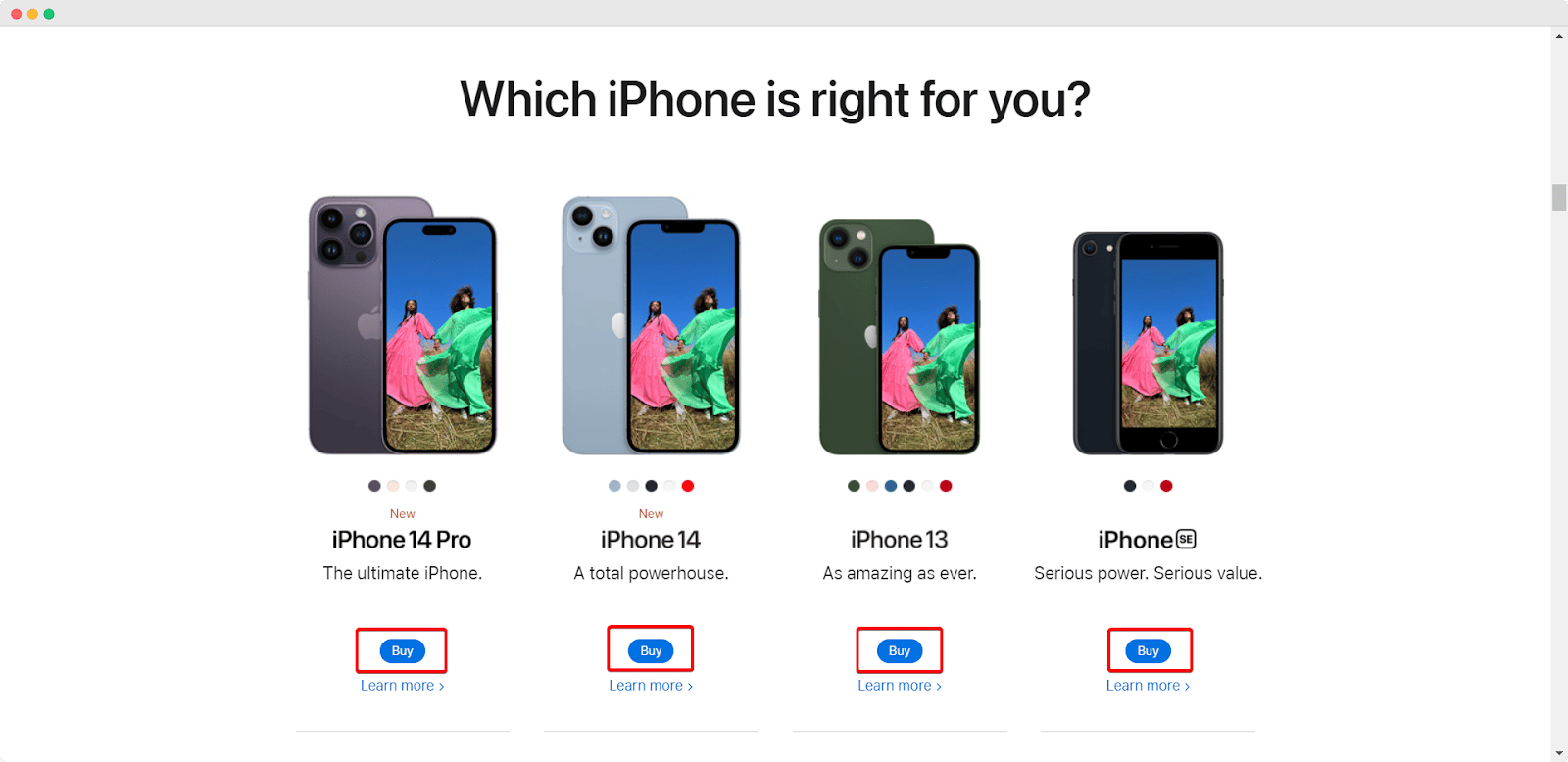
As Apple always thinks about user experience, they have kept their consistency on their CTA buttons as well. From this CTA button example, you can take inspiration for adding multiple call-to-action buttons on your website. Apple came up with the idea of using a single-word call to action with bold color and plenty of bold space around it. In addition, they have added an alternative call to action button as well. So, you can also follow this call to action button example to come up with your own idea.
4. Prezi
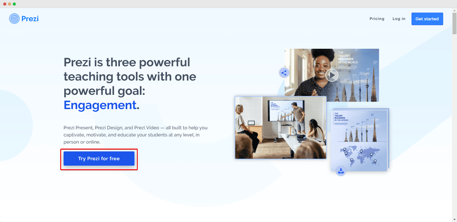
Prezi is one of the most popular presentation slide makers which has a minimalistic approach to its call to action button. With an eye-catchy color combination, they have added ‘Try Prezi for free’ on their CTA button in their hero section. This CTA button not only looks cool in their eyes but is also convincing enough to boost your conversion rate.
5. EPIC

EPIC has a convincing CTA button that can easily attract visitors. With an attractive color combination, Epic used inviting language to let users click their CTA buttons. Instead of small one or two-phrase buttons, they have written a long sentence saying ‘Start a new project with us’ on their CTA button. It might be a little long call to action, but with their design skill, and added animation, they have managed to showcase their whole CTA beautifully. You can also follow these types of CTA to increase your conversion rate.
6. Treehouse
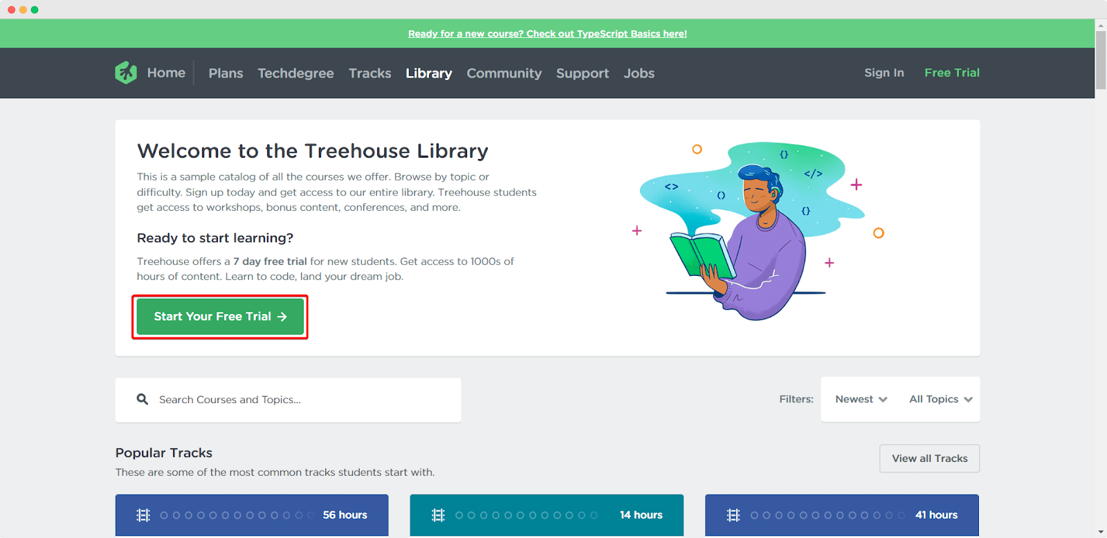
Treehouse comes with a personalized approach in its call to action button. Instead of just saying get started, or grab now, they have added ‘Start Your Free Trial’ on their CTA button. With this approach, they are giving a more personalized experience to their visitors which is a good strategy to increase the conversion rate.
7. Proflowers
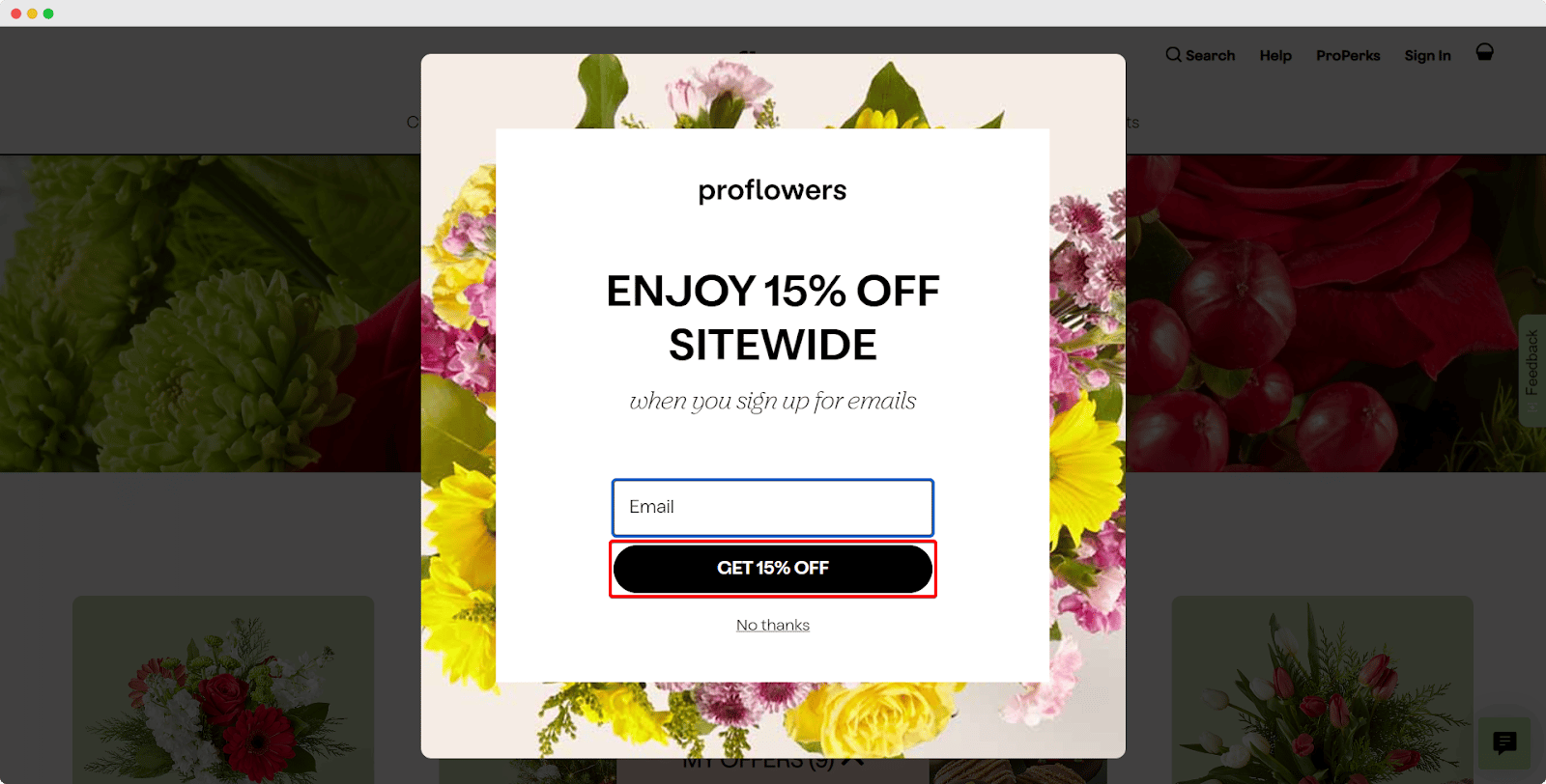
Proflowers has an creative call to action button on their popup window. They have a submission form there showcasing their discount. In addition, they have complied their discount amount on the call to action button with a power word. So, you can also follow this CTA example to make your own converting call to action button.
8. IMPACT

Not all calls to action need to be designed for sending visitors directly to your pricing plan. Sometimes, you can also grow your visitors’ interest through convincing copies and an interesting CTA button. From Impect’s CTA button, you can see a text saying ‘Talk with an advisor’ which is asking the visitors to get in contact with their special adviser. As a branding & design company before making the final decision any customer would love to talk with someone first. So, following this example, you can also add copies to your CTA that could be easily connected to your visitors.
9. Uber
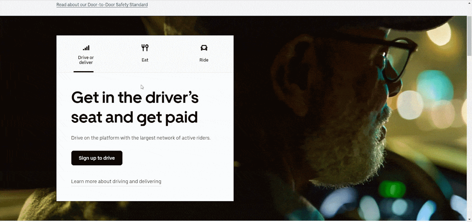
Uber is a ride-sharing platform that has 3 types of customers. Some of their customers are riders, some of them want food delivery and others are passengers. So, they need to add three call-to-action buttons on their website. Instead of adding three call-to-action buttons side by side, they separated the call-to-action button into three different places with small text and icons and asked three different types of groups to take action. So, you can also follow this example while designing your CTA button.
10. Spotify
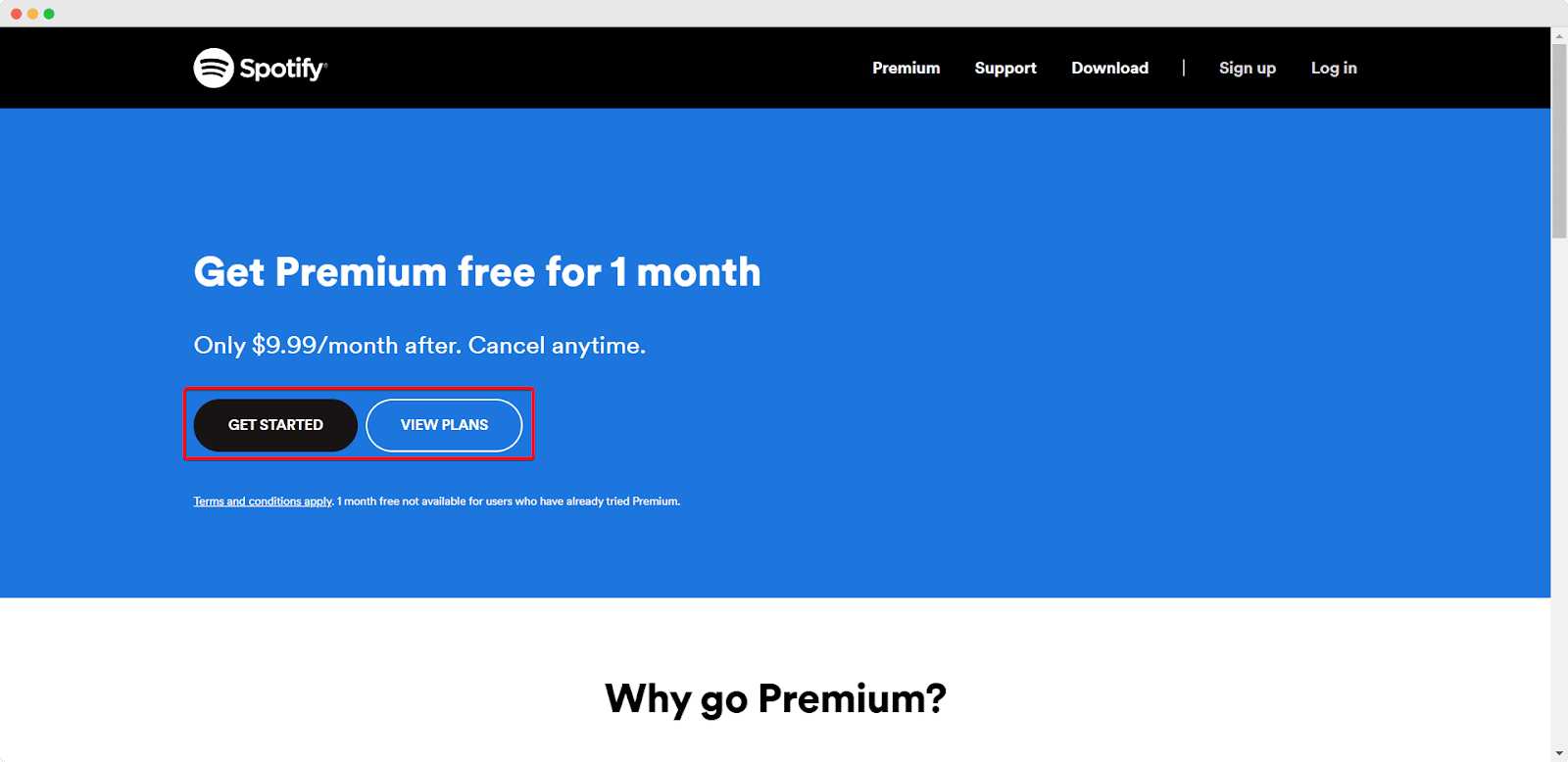
Spotify is a music streaming platform, which has both premium and free packages. In their hero section, they have added two beautiful calls to action asking the visitors to get started with whichever option they like. You can see their both free and premium options are highlighted with contrasting colors which are good enough to catch attention as well. So, you can also follow this approach while designing your CTA.
🎁 Bonus: Use Power Words To Boost Your Conversion Rates

If you want to boost your conversion rate, you must add effective call-to-action buttons on your site. Thus, you need to use power words on your CTA buttons to guide your visions into taking action. To save you from all the hassle of finding the triggering words, we have collected more than 200 power words that you can use on your CTA buttons and boost your conversion. If you are interested, you can check out this blog and find more than 200 power words to supercharge your marketing campaigns.
Have you found our blog useful? If you do, then please subscribe to our blog for more tutorials, guides, tips, and more. Also, don’t forget to join our Facebook Community and share your thoughts there.

Best Tool for WordPress Web Agencies
Finding the best tools for WordPress agencies can feel overwhelming – last Tuesday, I watched one of my

Best Cyber Monday Deals of 2025 for WordPress Web Agencies
Looking for the best Cyber Monday deals of 2025 for WordPress web agencies? You’re in the right place.
Judge.me is Leaving WordPress – Here’s the Best Judge.me Alternative (and How to Migrate Easily)
If you’re using Judge.me on your WooCommerce store, there’s an important update you can’t ignore: Judge.me is officially